Friday, December 16, 2016

Final Exam ARTS 427

Artist Statement

Heather Bennett

      This series is about acknowledging the humanity of others and thinking about our own biases toward people unlike ourselves. Presented are nine individuals of different races, backgrounds, and ages, in full figurative expressionist painting. Though many of them may be accepted more easily here in California, they would be looked down upon by the upper class and/or more conservative people in this country. At a time when there is so much hate perpetuated by the president-elect Donald Trump, the need to face our own prejudice towards people based on appearance and background is even more important. That being said, my subjects challenge the viewer to look them in the eyes and acknowledge them just as they are, when in real life we may avoid eye contact and keep walking. It is my goal to bring attention to the people who face discrimination in our society for one reason or another so that we may better grasp the humanity of these individuals. We cannot become so detached from those we consider lesser than ourselves that we forget how much we truly have in common. Therefore, this series is a study of humanity that encourages us all to face our own prejudice and sympathize with people not so unlike ourselves. Hopefully my subjects can offer a variety of perspectives on life and on how we view those around us. Though we may come from many different places and identify as many different things, we can't forget that which unites us and makes us all, quite simply, human.
That being said, every subject in this series is a person I have gotten to know personally and respect a great deal. Each painting is titled by the subjects themselves, based on what they wanted the viewers to know about them. Titles will be provided in clear sight along with their corresponding subjects.
Stylistically, I draw inspiration from pop artist Wayne Thiebaud, a cartoonist turned oil painter who first began turning heads with his playful paintings of cakes and pies in the 1960's. We already share a love of vibrant, subjective color, and his signature application of thick, creamy paint is visually appealing to me. Since I want my subjects to be looked at, I feel that this approach provides additional visual interest. The viewers need to spend more time looking at them than a passing glance.
Each piece in the series (minus the little girl) is done on 30"x 40" canvas. Acrylic paint was the primary medium, with ink and eyeshadow used as needed. I worked from top to bottom on each piece. Paint was applied with brush and fingertip, and I allowed my selection of abstract/subjective color to be spontaneous yet particular to each subject. The figures are built up with layers of acrlyic paint and transparent matte gel medium, the latter of which was used to increase the vibrancy of color and the thickness of paint on canvas. A final layer of matte gel medium is used as a varnish to protect the painting. Opaque gel was used to build up the creamy, thick paint for the space surrounding each figure.


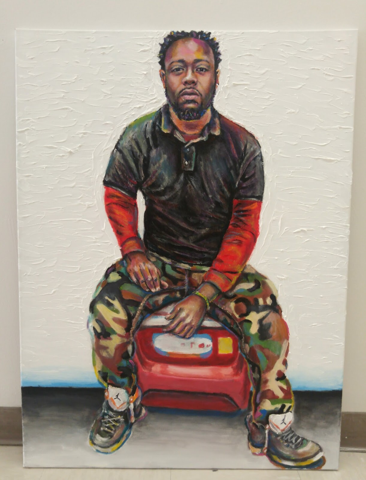
                            Portrait of a Loving Father, acrylic on canvas, 40"H x 30"W


Portrait of  a Compassionate Man, acrylic on canvas, 40"H x 30"W


Portrait of an Ordinary Girl, acrylic on canvas, 28"H x 29"W


Portrait of a Fine Artist, acrylic on canvas, 40"H x 30"W


Portrait of a Peaceful Soul, acrylic on canvas, 40"H x 30"W


Portrait of a Director, acrylic on canvas, 40"H x 30"W


Portrait of a Good Son, acrylic on canvas, 40"W x 30"W


Portrait of a Proud Mother, acrylic on canvas, 40"H x 30"W


Portrait of a Work in Progress, acrylic on canvas, 40"H x 30"W


Series Painting #9: In Progress

Projected sketch. 

Beginning with blacks for darkest points and shadows.

Hair and middle values for the face are added as loose directions. I'm amused by the fact that the painting of myself is approached more sporadically.


More skin color added, basic highlights.

More shadows and shapes of the face are added loosely. This was the beginning of me going too dark on the face.

I start to work on the body before the face is finished this time. Opaque gel is added to the background around the figure.  Now the face needs to be readdressed, as the shadows have gotten far too dark and harsh.

The features of the face are lightened up significantly, then back on to detailing the body and background.

Last highlights made on the face, as well as additional minor touch ups. The painting is about completed here.

Thursday, December 15, 2016

Series Painting #8: In Progress

Projected sketch.

Black added first.

Second to darkest values added second.

More actual light and skin color added.

More paint added to face to cover up canvas and gain basic understanding of facial shapes. This process repeated.

Selective color and better highlights added, refinement of facial features. Focus shifts to hair and body.

I work my way down the painting. Once again I leave the hands and feet for special focus near the end of the painting.
 The painting Shown here is near completion, requiring more refinement of other features and some more selective color.

Series Painting #7: In Progress

I start with the projected sketch.

I start with black to make the darkest shadows/points of the face.


Second to darkest values added next, sparingly.

The face is loosely colored in. I will layer over the face repeatedly until this area is fully saturated with paint and expresses the best likeness. 

Refinement of facial features, then on to painting the body in.


I paint up to the hands and feet. I almost always focus on these elements last.

More layers and subjective color are added. Creamy modeling paste is added to the background. This painting is shown here at near completion.


Monday, November 14, 2016

Art21 "Exclusive" on Eli Sudbrack: Process and Materials

         I recently watched an ART21 "Exclusive" video about the work of Eli Sudbrack, a member of the artist collective, "assume vivid astro focus". The video can be seen here:

Art21 "Exclusive" on Eli Sudbrack

         What I found most interesting about Sudbrack's art was his process for making it. It's worth noting that the artist only started painting a year prior to this video. As a result, Sudbrack is "still learning" and uses a very structred process to layout each piece of artwork. Because he works so large and uses expensive paints, Sudbrack first draws out his potential design on a small piece of paper and uses clear plastic overlays of color over the drawing to make choices on color and composition before he commits to the actual canvas. The overlays, which are colored using the actual paints he will use for the final piece, can be layered and swapped out seemlessly over the initial drawing. I find this method of figuring out the composition not only intuitive, but also cost-effective. Quality paint of any sort is expensive, so deliberately reducing our use of it by knowing what color we want for the final composition before we even start the painting can be incredibly beneficial.

Speaking of paints, Eli Sudbrack's choice of paint is also quite interesting. He chooses to use Krink K-60 paints, commonly used by graffiti taggers. This is opaque, pigmented, permanent ink of the highest quality, made in New York. The paint comes in a 60 ml bottle and has a marker tip. However, Sudbrack removes the tip and dips a small brush in the bottle to apply paint to his surface. What I enjoy about this paint is its vibrant and saturated quality, as I am particularly attracted to bold and beautiful color. I can see why this paint is used by graffiti taggers, and the idea of using alternative paints on canvas has me thinking more outside the box on what I can use for my own paintings to achieve the color I want.

          That being said, I intend to take what I've learned from this unique artist's process and apply it to my own processes as an artist. I will try implementing Sudbrack's use of color overlays to test out my own compositional ideas before bringing them to canvas. Patience and careful planning are things I lack when designing my own pieces, as I usually jump into my paintings more spontaneously and figure it out as I go. This can be a good trait as well as a negative one. I want to add more structure to my design process so that I can continue to mature as an artist. Additionally, I am interested in trying Krink paint markers in my own work and applying them the same way Sudbrack does. I checked into the actual cost of Krink K-60 markers, and for one 60ml bottle of one color it is 15 dollars. Clearly this artist had the excess money to spend on as many Krink markers he wanted, but I most certainly do not. On the website Jerry's ArtoRama, numerous Krink paints are offered for slightly lower prices. The K-60 sells for 13 dollars here instead of 15 dollars on the official website. Another alternative is the Krink 42 paint marker, which sells for $7.69 each and can be found here:

http://www.jerrysartarama.com/k-42-opaque-paint-markers

          I might buy one Krink marker in a color I use for highlights, just to see how I like it. These individual markers are still a little too costly for me when I'm on a budget, however. The same website offers LIquitex brand paint markers in sets, another possible alternative If I want more quality colors for less. Instead of paying over 90 dollars for 6 Krink markers, I could be paying 30-40 dollars instead for another professional brand. This option can be found here:

http://www.jerrysartarama.com/liquitex-marker-sets-and-accessories

          I will continue to experiment and broaden my horizons as an artist. There is always something new to try and something new to learn.

Tuesday, October 25, 2016

Series Painting #6: In Progress

I begin yet again with a loose projected sketch.


  I add the darkest values first and emphasize important shapes in the face.
Next I paint in middle values and then highlights. I do this quickly and loosely.

I start painting in the body so that those shapes will inform my approach to the head and bring the figure together. I realize that the torso is a little too big compared to the source photo. 

I thin out the torso and reshape the head accordingly. Layers of gel medium increase the saturation of paint in the face and allow me to smooth out details.  

I continue to add subjective color and focus on the shapes That make up the figure.
 With Wayne Thiebaud in mind, I thicken up the paint aground the figure a little more and it a colorful line around the edges of shadows. I will continue to refine this painting and clean up all edges. the white space surrounding the figure will be thickened up drastically to match my previous entries in the series.


Series Painting #5: In Progress

I start with the loose projected sketch.


I begin painting by putting down the shadow areas.

The darkest values are added And act as guidelines for future shapes in the face.

Middle values and highlights are put in quickly. The volume of hair surrounding the face is painted in, also very loosely.

I shift attention to painting in the lines that will connect this portion of the couch with that shown in my second painting for the series. This transgender woman will be sitting across from the man wearing the cowbell shirt. I measure the shapes for the couch accordingly and start painting in more of the figure's body.

At this point in the painting. I slow down and begin to really focus on fine-tuning the face for the best likeness. I add texture to the white background surrounding the figure and attempt to color match this half of the couch with the other half in my previous painting. More subjective color is added and I pay more attention to edges. I will continue to work on this painting, bringing out more detail in the arm tattoo and cleaning up the overall composition.